Artwork
Card front cover for Slimvolume
Card front cover for Slimvolume is a print by Åbäke. It dates from 2007 and is held in the collection of the Victoria and Albert Museum.
About this work
Overview
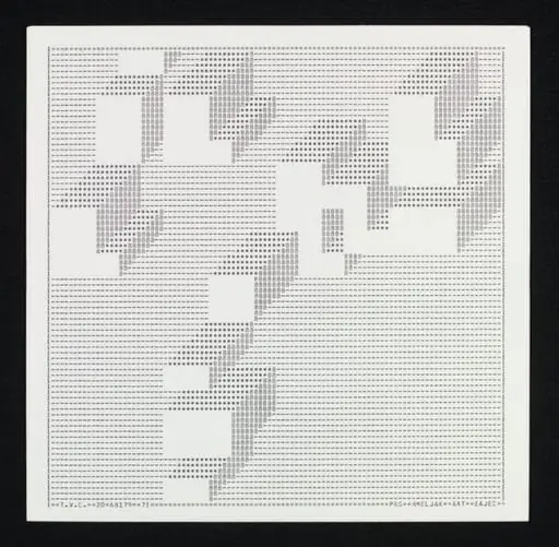
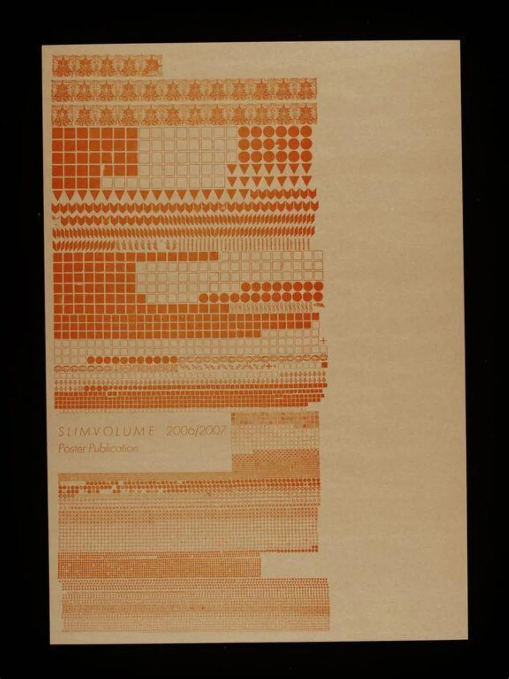
Its surface is densely populated with abstract geometric forms—squares, circles, lines, and dots—arranged in tight, non-repeating sequences.
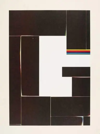
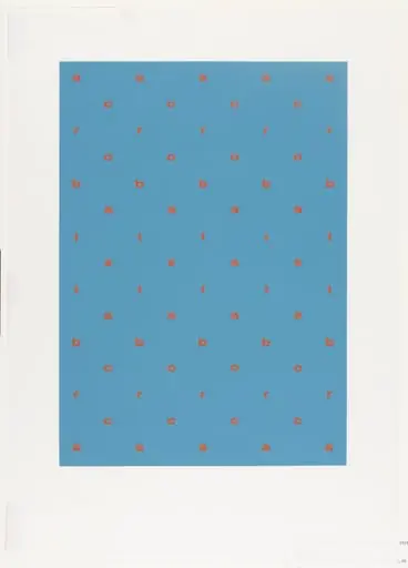
The front cover of Slimvolume, published by Åbäke in 2007, is a printed card stock design using a single shade of orange ink. Its surface is densely populated with abstract geometric forms—squares, circles, lines, and dots—arranged in tight, non-repeating sequences. The composition avoids figuration, relying instead on rhythm and density to create visual tension. The flat, unmodulated color and lack of depth give the surface a muted, almost archival quality.
Subject & Meaning
The design presents no narrative or symbolic imagery, instead prioritizing structure over meaning. The repetition of basic shapes suggests an exploration of system-based aesthetics, possibly referencing early 20th-century modernist grids or typographic experiments. Its abstraction invites contemplation of pattern as autonomous form, resisting interpretation in favor of perceptual engagement with arrangement and density.
Technique & Style
Printed in a single ink color on card, the cover employs precise, mechanical repetition to build texture through variation in shape density. Areas of dense dot clusters contrast with solid blocks and linear elements, creating a sense of visual rhythm without gradient or shadow. The style aligns with minimalist graphic design traditions, emphasizing reduction and seriality over ornamentation or emotional expression.
History & Provenance
Produced by the design collective Åbäke for their Slimvolume series, this cover is part of a limited-run publication initiative from 2007. The series often explored experimental layouts and material constraints, with this cover reflecting their interest in reductive visual systems. No known alterations or later editions exist; the original print run remains the sole version.
Context
Emerging from the UK’s independent publishing scene of the mid-2000s, the cover reflects broader trends in graphic design that favored conceptual minimalism and analog experimentation. It shares affinities with the work of designers influenced by Swiss typography and concrete art, while resisting commercial polish in favor of raw, process-driven composition.
Legacy
The cover remains a reference point in discussions of non-narrative graphic design, particularly within educational and archival circles. Its restrained palette and systematic composition have been cited in studies of pattern-based layout, influencing later designers exploring abstraction in print media without recourse to digital effects.
Artist & collection
Artist
Åbäke is a transdisciplinary graphic design collective, founded in 2000 by Patrick Lacey (British), Benjamin Reichen (French), Kajsa Ståhl (Swedish) and Maki Suzuki (French) in London, England, after meeting at the Royal College of Art.