Artwork
Mislaid. Who Gets the Benefit
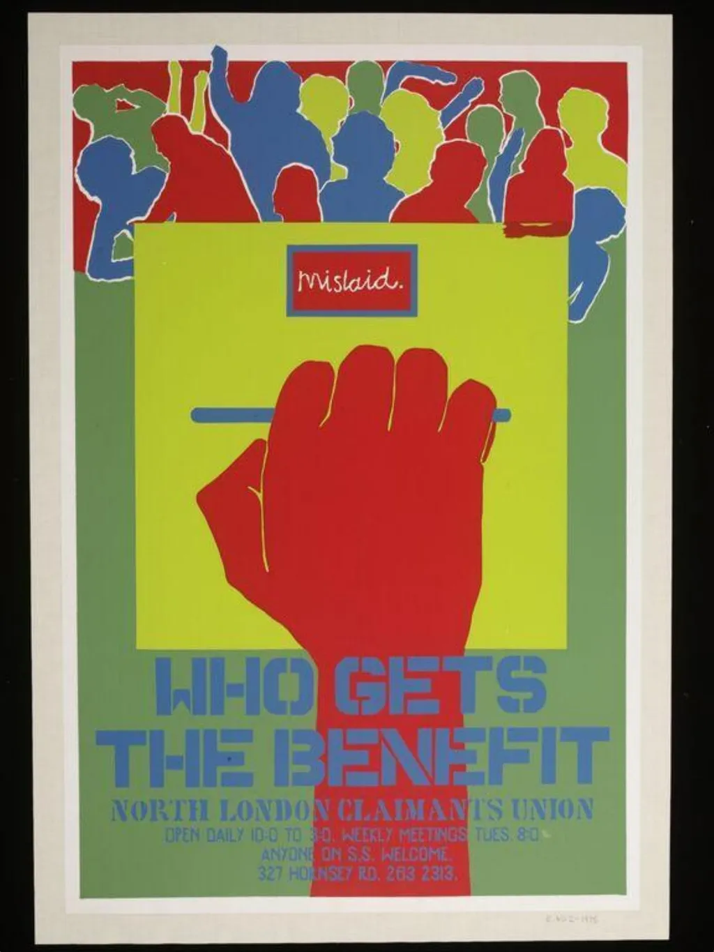
Mislaid. Who Gets the Benefit is a poster by Bernadette Brittain. It dates from 1974 and is held in the collection of the Victoria and Albert Museum.
About this work
Overview
Its stark graphic style and limited color palette prioritize clarity and urgency, transforming political messaging into accessible public communication.
Created in 1974 by Bernadette Brittain, this screen-printed poster was produced for the North London Claimant's Union to advocate for welfare rights. Its stark graphic style and limited color palette prioritize clarity and urgency, transforming political messaging into accessible public communication. Designed for street display, it blends activism with visual economy, using minimal elements to provoke thought about social support systems.
Subject & Meaning
The poster interrogates the distribution of welfare benefits through symbolic imagery. A row of anonymous, colored figures represents claimants, while a massive red hand above them—marked with a horizontal blue line—suggests either direction or obstruction. The phrase 'Mislaid. Who Gets the Benefit?' questions accountability, implying that aid may be misdirected or withheld. The ambiguity of the hand’s intent invites viewers to consider institutional power dynamics.
Technique & Style
Using screen printing, Brittain employed flat, unmodulated colors and bold outlines to ensure legibility at a distance. The stick-figure forms and geometric hand reduce human and institutional elements to essential shapes, avoiding detail in favor of symbolic impact. Text is set in uniform, sans-serif block letters, reinforcing the poster’s utilitarian purpose. The composition is tightly structured, with visual weight concentrated in the upper half to draw immediate attention.
History & Provenance
The poster was produced during a period of heightened activism around welfare policy in Britain, when grassroots organizations like the North London Claimant's Union mobilized to challenge bureaucratic neglect. It circulated locally through community centers and protests, serving as both a call to action and a record of collective resistance. Its preservation in the Victoria and Albert Museum reflects its recognition as a document of social history rather than commercial design.
Context
Emerging in the mid-1970s, the poster responds to austerity measures and rising unemployment in the UK. It aligns with a broader movement of activist graphics that rejected polished advertising aesthetics in favor of raw, direct communication. Similar posters from this era were often produced by collectives without formal design training, prioritizing message over ornament. Brittain’s work reflects this DIY ethos, rooted in community organizing rather than institutional art practice.
Legacy
Though not widely reproduced beyond its original distribution, the poster remains a significant example of British activist graphic design from the 1970s. It is studied for its ability to distill complex social issues into uncompromising visual language. Its inclusion in museum collections underscores its value as a historical artifact, offering insight into how marginalized groups used design to assert their demands in public space.
Artist & collection
Artist
These five posters came out of South Africa in 1974, sharp, black-and-white prints meant to wake people up.