Artwork
Contemporary Canadian Prints
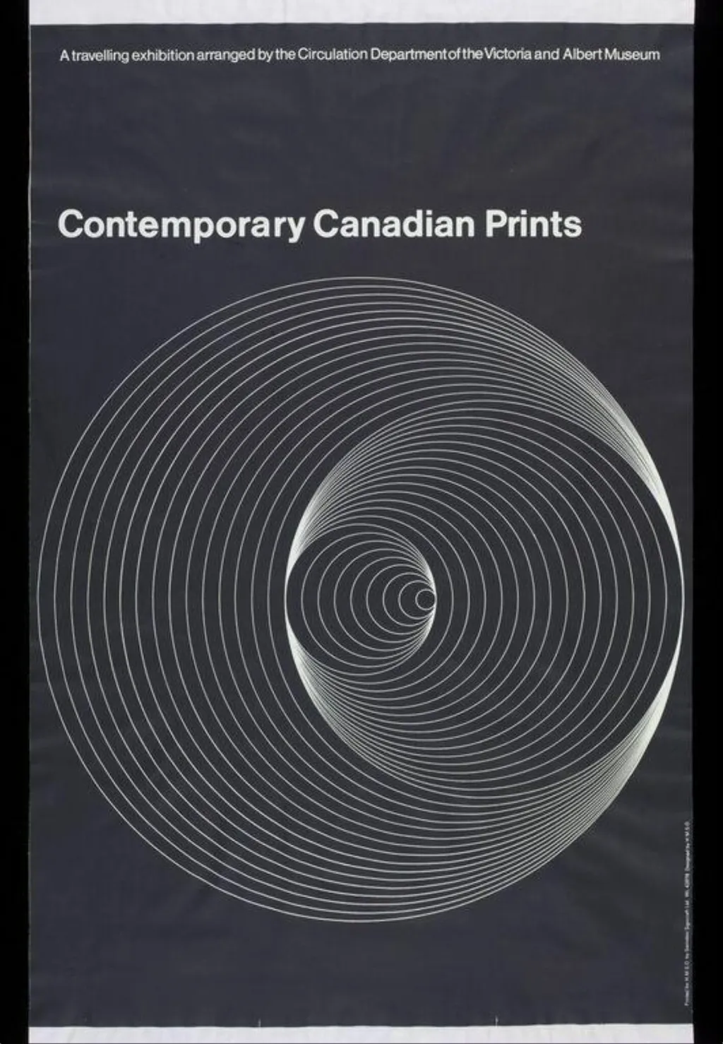
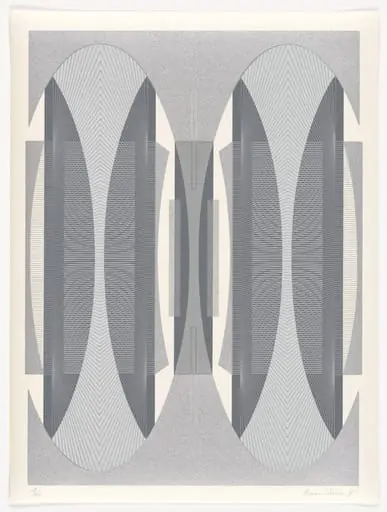
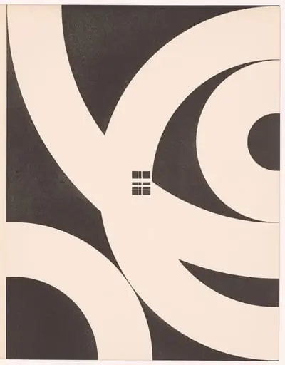
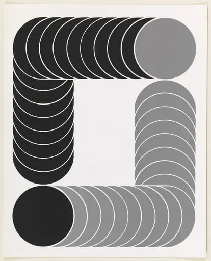
Contemporary Canadian Prints is a poster by Peter Branfield. It dates from 1966 and is held in the collection of the Victoria and Albert Museum.
About this work
The clean, geometric style suggests it’s more about shape and repetition than realism.
This poster shows a black background with a series of white spiral lines. The lines start small in the center and grow wider as they move outward. The design looks simple but creates a sense of movement just by following the curves.
The title at the top reads *Contemporary Canadian Prints*, and it’s from 1966. The clean, geometric style suggests it’s more about shape and repetition than realism.
If you like this kind of abstract design, check out Branfield, Peter.
Overview
This 1966 poster was produced to promote an exhibition of contemporary Canadian prints circulated by the Victoria and Albert Museum. Printed in offset lithography, it features a minimalist composition on a black field, using only white lines to convey motion and structure. Its design avoids figurative elements, focusing instead on abstract form and spatial rhythm to attract attention and communicate modernity.
Subject & Meaning
The poster does not depict specific artworks or artists but instead uses a spiraling pattern to symbolize the dynamic energy of Canadian printmaking at the time. The expanding curves suggest growth, circulation, and the unfolding of creative ideas—metaphors aligned with the exhibition’s goal of introducing regional art to broader audiences through institutional outreach.
Technique & Style
Offset lithography enabled sharp, consistent reproduction of the poster’s geometric lines. The design relies on high contrast and repetition, with no gradients or textures. The white spirals, radiating from a central point, create optical movement through precise gradation of spacing and scale, reflecting mid-century modernist principles that valued clarity and abstraction over ornamentation.
History & Provenance
Commissioned by the Victoria and Albert Museum’s Circulation Department, the poster was part of a broader initiative to distribute British and international art exhibitions across Canada. It was printed in 1966 for use in public venues and educational institutions, serving as both advertisement and cultural ambassador for Canadian printmakers during a period of growing national artistic visibility.
Context
In the mid-1960s, Canadian printmaking was gaining institutional recognition, with artists exploring abstraction and experimental techniques. This poster reflects a wider trend in graphic design where cultural institutions adopted clean, geometric aesthetics to signal modernity and intellectual rigor, distancing themselves from traditional illustrative styles in favor of conceptual clarity.
Legacy
The poster remains a representative example of institutional graphic design from Canada’s postwar cultural expansion. Its restrained visual language influenced later exhibition materials in Canadian museums, emphasizing form over narrative. Though unsigned, its association with the V&A’s outreach program ensures its place in the history of Canadian art dissemination.
Artist & collection
Artist
Peter Branfield had a habit of turning plain paper into posters that startled you.