Artwork
EXPOSE: LCP Design Staff Exhibition
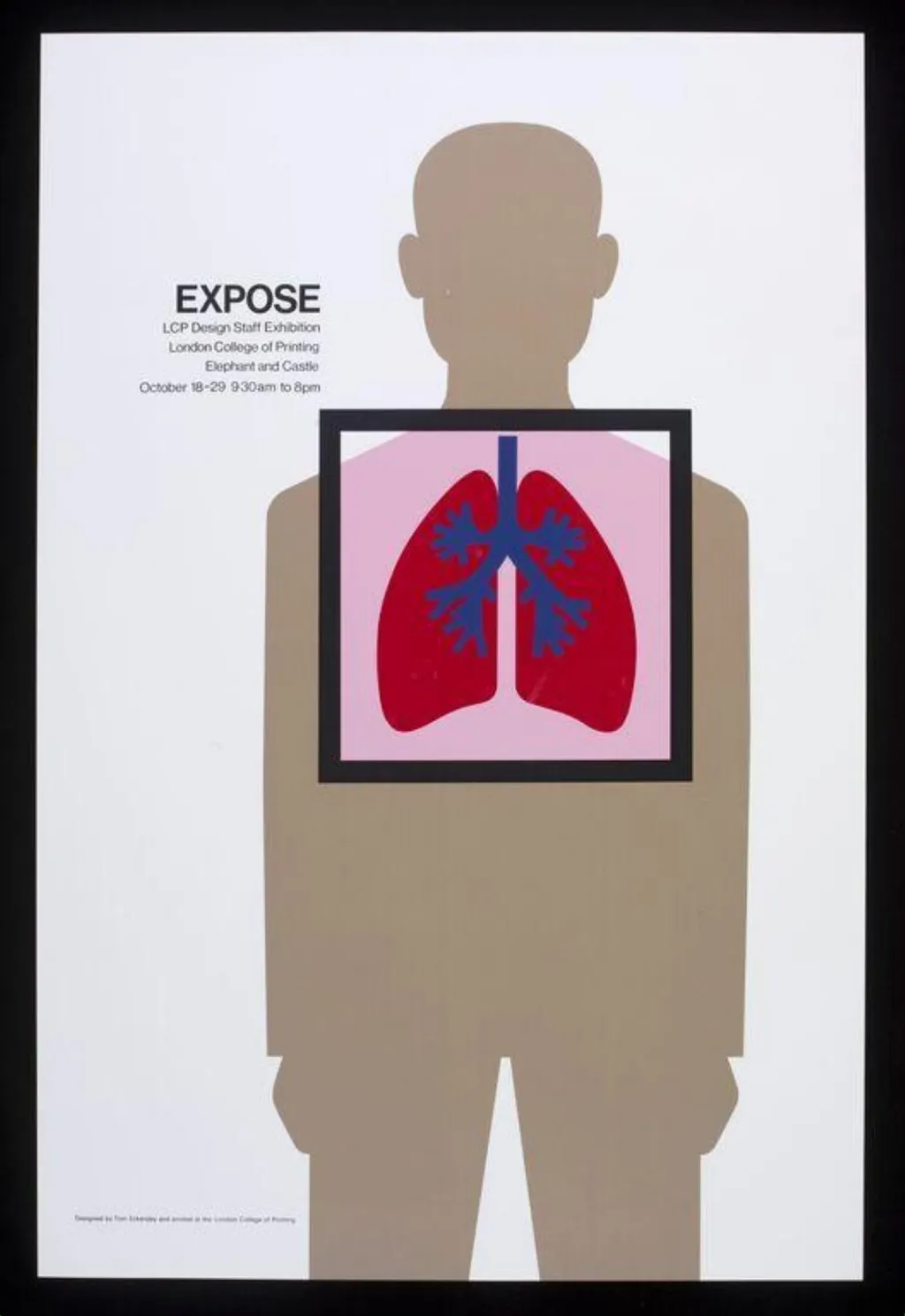
EXPOSE: LCP Design Staff Exhibition is a poster by Tom Eckersley. It is held in the collection of the Victoria and Albert Museum. This poster was created for an exhibition by the LCP Design Staff, presenting a minimalist visual statement.
About this work
Overview
The design avoids decorative elements, focusing instead on clarity and symbolic directness to communicate its purpose as a public announcement.
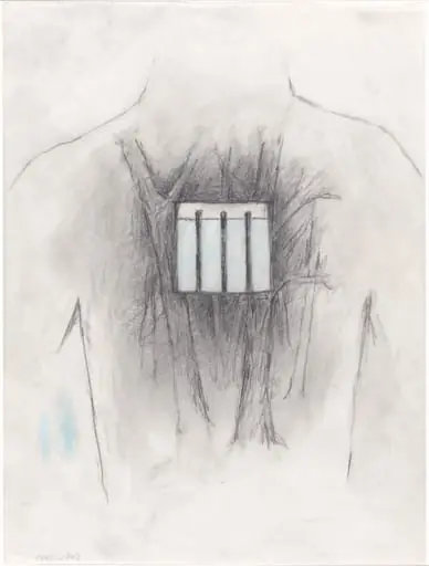
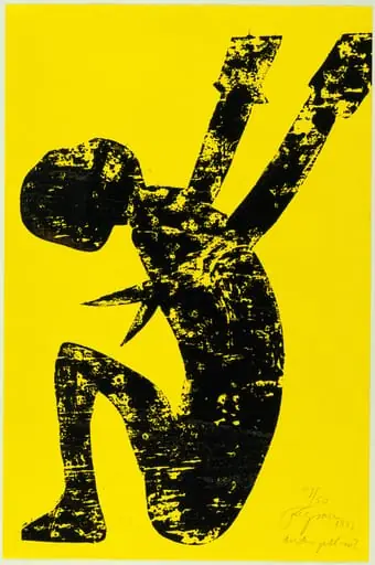
This poster was created for an exhibition by the LCP Design Staff, presenting a minimalist visual statement. A simplified human silhouette in brown occupies the center, set against a plain white background. A black rectangular frame overlays the chest, revealing internal organs. The design avoids decorative elements, focusing instead on clarity and symbolic directness to communicate its purpose as a public announcement.
Subject & Meaning
The poster uses the human form and exposed lungs as a metaphor for revelation or scrutiny. The lungs, rendered in vivid red with blue vascular lines, suggest biological transparency—perhaps referencing health, labor, or environmental exposure. The title 'EXPOSE' reinforces this theme, inviting viewers to consider what is typically hidden within the body or society. No additional imagery distracts from this focused inquiry.
Technique & Style
The poster employs flat, unmodulated colors and clean geometric shapes typical of mid-century graphic design. The silhouette lacks anatomical detail, reducing the body to an outline. The lungs inside the frame are stylized but scientifically recognizable, using high-contrast hues to draw attention. Typography is simple and aligned to the left, prioritizing legibility over ornamentation, consistent with functional design principles.
History & Provenance
Produced for an internal exhibition by the London College of Printing’s design staff, this poster likely dates to the 1960s or 1970s. It was not intended for mass commercial use but as a curated display of student and faculty work. Its survival suggests institutional archiving, possibly within the V&A’s collection of British graphic design, where similar pedagogical materials are preserved.
Context
Emerging from a design education environment, the poster reflects a broader trend in postwar British graphic design that valued conceptual clarity and social relevance. It aligns with movements that used visual economy to address public issues—health, labor, or institutional transparency. Unlike advertising posters, it avoids persuasion, instead prompting reflection through stripped-down imagery and precise composition.
Legacy
The poster exemplifies how design can communicate complex ideas without narrative or embellishment. Its influence is seen in later public health campaigns and institutional exhibitions that favor symbolic abstraction over literal representation. Though modest in scale, it remains a reference point for educators and designers exploring the intersection of visual minimalism and civic messaging.
Artist & collection
Artist
Tom Eckersley spent his life turning plain words into bold, no-nonsense posters—think of him as the guy who made train schedules look cool.

 100 years of printing education
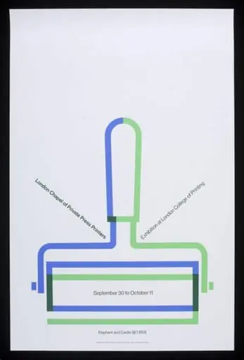 London Chapel of Private Press Printers Exhibition at London College of Printing
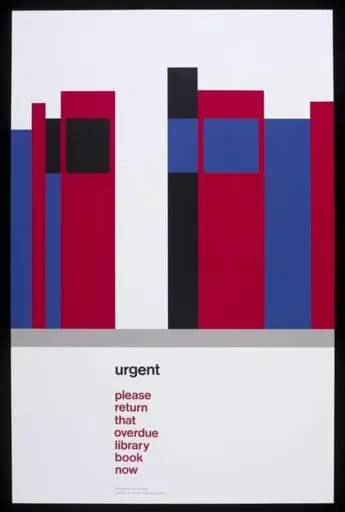 urgent please return that overdue library book now
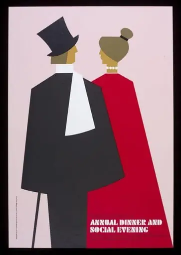 Annual Dinner and Social Evening LCP poster
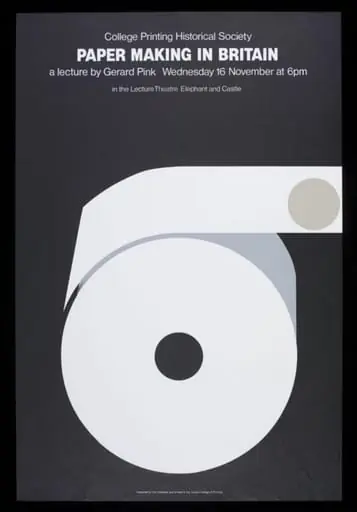 Paper Making in Britain
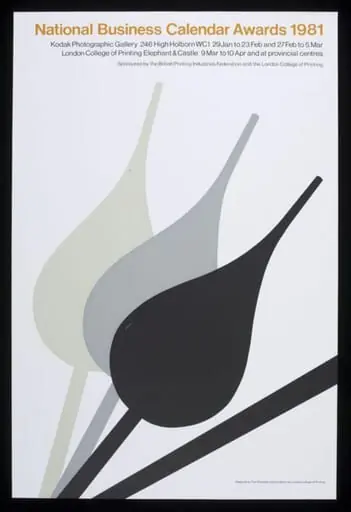 National Business Calendar Awards 1981
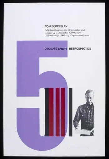 Tom Eckersley: 5 Decades 1935-1975
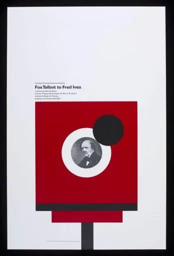 Fox Talbot to Fred Ives photography lecture